
Visual Hierarchy
A good visual hierarchy in web design displays elements in a way that communicates the importance of each element. In brief, the most important things on a page should be relatively bigger in size and located towards the top.
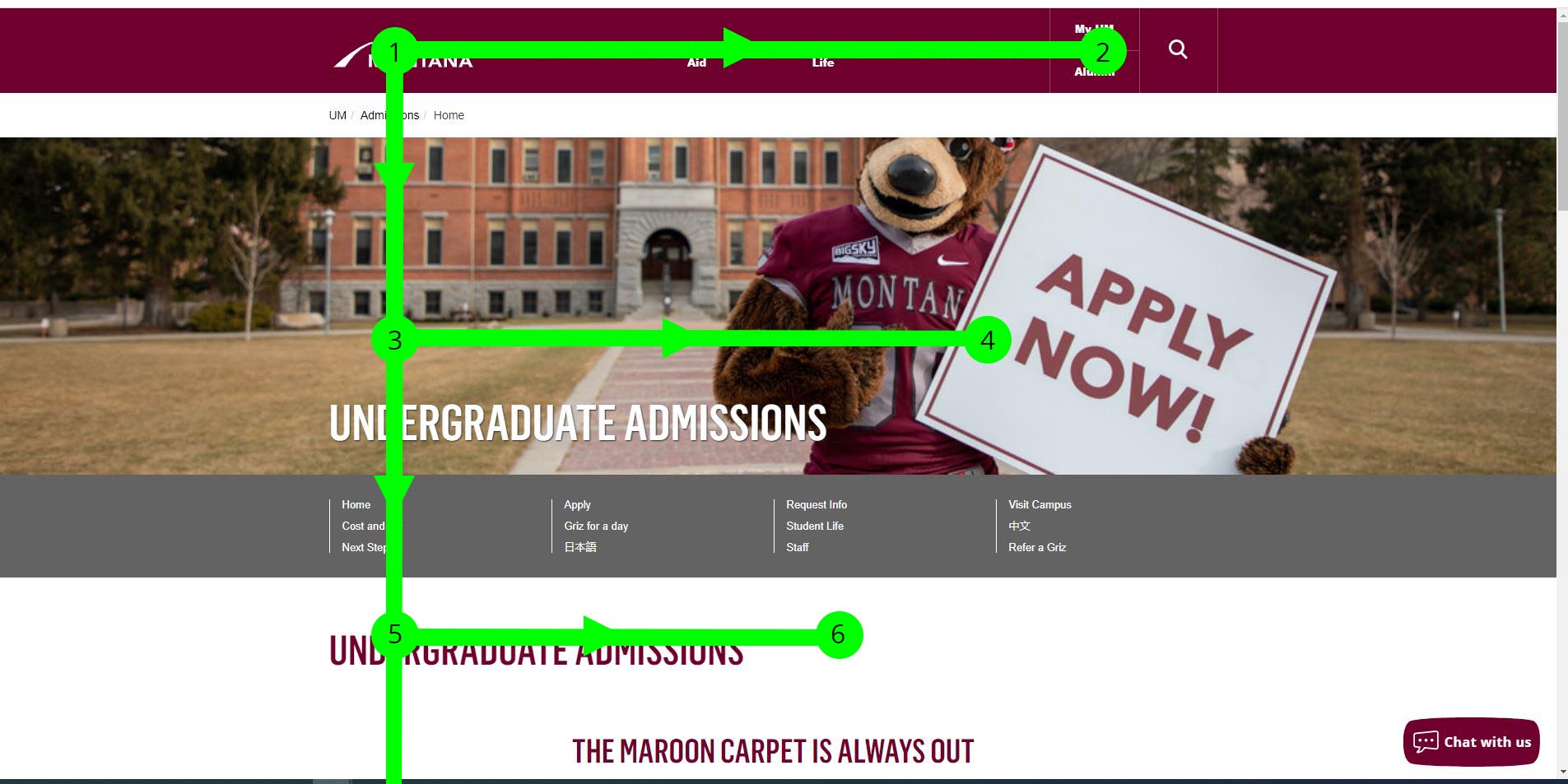
The F-Pattern
Website visitors read sites in an F-Shaped pattern (left to right, top to bottom), quickly looking over images and content to get the information they want. Visitors tend to scan all the way from left to right at the top of a page, but then as they move down a page they tend to not go as far to the right and spend more time on the left side of the page.
Make your visual hierarchy clear and obvious
A great way to make sure that a page is quickly and easily understandable (doesn't make the visitor think!) is to arrange the elements so that the importance of elements and their relationship to each other is communicated visually.
The most important elements are located towards the top. And related elements are grouped together such as in a list or an Accordion Block.
More prominent equals more important
For example, top-level headings, such as H1s or H2s are larger and set off by more white space.
Visually connect elements that are related
Arrange logically related items under the same heading or as part of the same block.