
Buttons Should Be Used as Calls to Action
The use of a button should be reserved as a call to action. For example, buttons should be used to link to event registrations, forms that collect information, etc. They should not be used just to link a user to another page on your site. That function should be fulfilled by link text or your site's navigation.
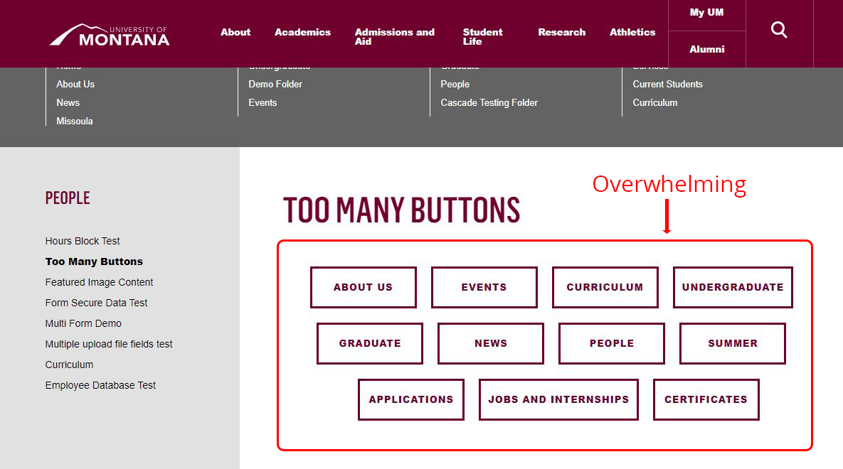
Too Many Buttons in one row
Too many buttons in one row looks cluttered and can be confusing, leaving the user wondering where to look. A large number of buttons in one row is a sign that you may be trying to recreate your site's navigation using buttons. This is not a best practice, will lead to a poor user experience and should be avoided.
Don't use Images as Buttons
Don't use images as buttons, even if it is an image of a button. Please use the Button Block to create all buttons. The text on the button in an image is inaccessible as it cannot be read by a screen reader. Additionally, the buttons in the Buttons Block will be consistent with all other buttons on the UM website and visitors will immediately recognize the button for what it is when they see it, and not have to wonder if it is something they can click on.